

When legacy consumer packaged goods (CPG) giants update their core offerings, they often fall into one of two traps: an imperceptible micro-tweak that fails to recruit new cohorts, or a radical, unanchored overhaul that strips away decades of consumer memory structures (similar to Tropicana’s infamous packaging disaster).
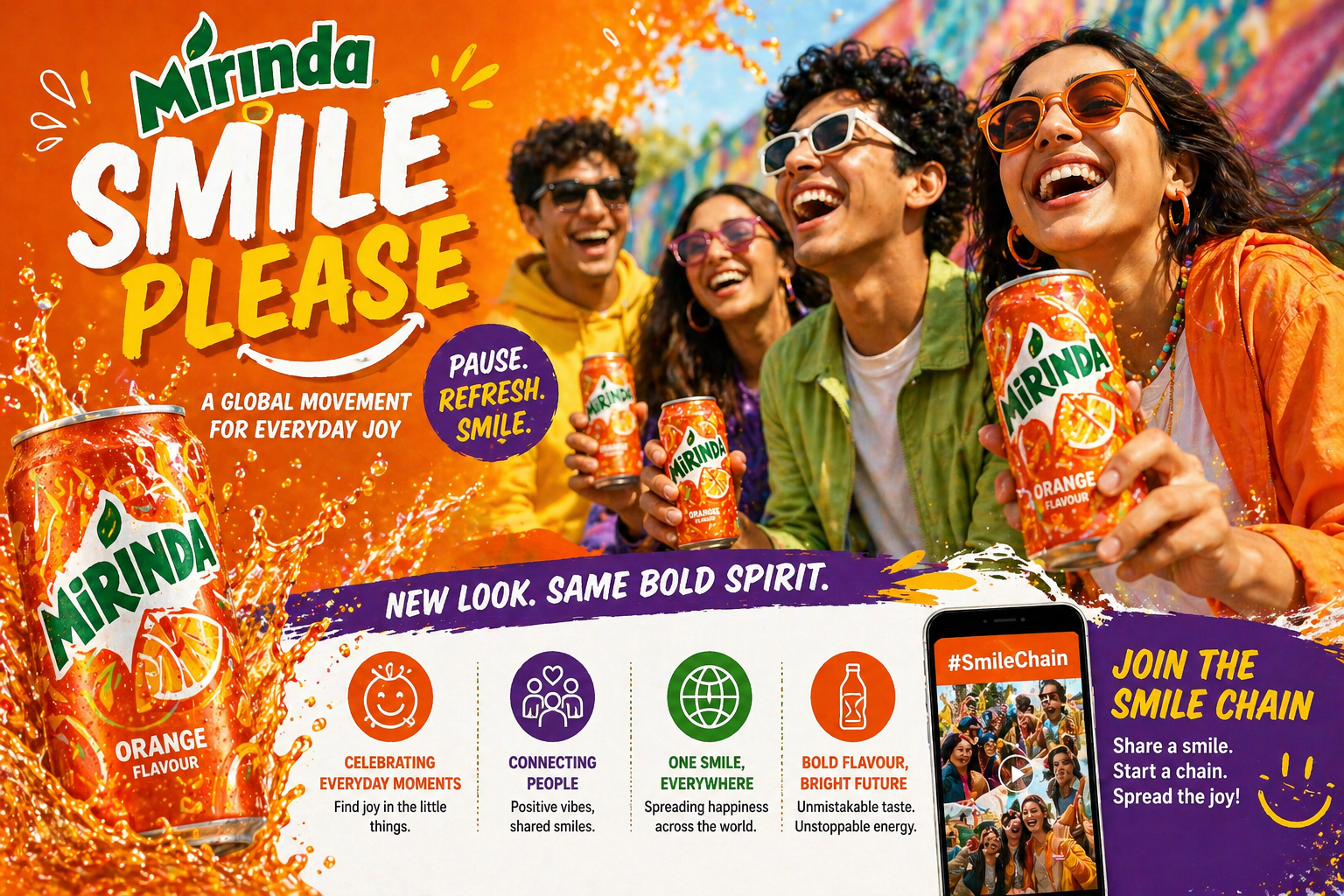
With its “Smile Please” global platform restage, PepsiCo bypassed both hazards. Rather than releasing a generic press release summary about “connecting with next-gen audiences,” the initiative serves as an instructive masterclass in packaging semiotics, cross-cultural portfolio management, and modern FMCG visual architecture.
As explored across the Advertising & Strategy archives at All Marketing Updates, today’s consumer connections require moving beyond purely transactional messaging. Here is an in-depth strategic analysis of how PepsiCo transitioned Mirinda from chaotic 2000s slapstick equity into an agile, high-contrast visual system built for Gen Z.
The Visual Semiotics: Decoding the New Packaging Language
The traditional stumbling block for fruit-flavored carbonated soft drinks (CSDs) has always been visual clutter. For over two decades, Mirinda’s packaging architecture leaned heavily on hyperactive splatter patterns, 3D bubble renders, skewed italicized letterforms, and hyper-realistic fruit photography.
While those tropes succeeded during the broadcast television boom of the 1990s and 2000s, they clash directly with modern minimalist design languages, responsive user interfaces, and mobile checkout feeds.
PepsiCo Design & Innovation systematically deconstructed and rebuilt the packaging around three distinct semiotic levers:
The “Smile” Semi-Circle Fruit Asset
The central anchor of the redesign is an abstracted fruit wedge stylized into an exaggerated, upward-curving smile:
- Dual-Signifier Encoding: The motif functions simultaneously as an organic fruit slice (signaling juicy taste appeal) and an undeniable human smile. Cognitive neuroscience shows that through pareidolia, human vision prioritizes facial and smile recognition over abstract geometric shapes.
- Modular Multi-SKU Architecture: Divorcing flavor signifiers from photorealistic fruit renders allows the smile silhouette to scale effortlessly across variants. Whether applied to Orange, Green Apple, Strawberry, Pineapple, or Grape, the structural geometry remains identical while internal pulp textures and seed accents adjust to reflect the fruit’s anatomy.
- Top-of-Can Dominance: Anchored in the top third of the can, the asset draws the consumer’s eye upward toward the opening tab, visually reinforcing the act of opening and consumption.
Retro-Modern Typography
The updated wordmark replaces the harsh, slanted italic types of prior decades with heavy, grounded, and rhythmic letterforms:
- Chunky Grotesque Influences: The letterforms borrow warmth from 1970s and 1980s display typography (reminiscent of Cooper Black and vintage editorial signage).
- Mobile & Digital-First Scannability: Unlike slanted scripts that lose legibility at low resolutions, upright, uniform letterforms maintain crisp readability within 40×40 pixel icons on quick-commerce apps and mobile grocery lists.
- Kinetic Micro-Rhythms: The characters feature subtle baseline variations, giving the logo an intrinsic bouncing energy without requiring literal 3D rendering or motion blur.
High-Contrast, Flat-Dye Color Palette
- Hyper-Saturated Solid Fields: Gradients and lens flares have been replaced with solid, saturated field colors: punchy electric orange, mint cyan, raspberry red, and zesty citrus yellow.
- The “Optical Pop” Rule: Placing warm fruit iconography over high-contrast cool backgrounds (like orange over sky blue or citrus over deep teal) creates an immediate optical pop on retail shelves and smartphone screens alike.
| Design Vector | Legacy Identity (2010s) | “Smile Please” Identity | Strategic Rationale |
| Typography | Slanted, sharp sans-serif with 3D drop shadows | Heavy, grounded retro-modern display type | Immediate legibility on mobile/q-commerce screens |
| Fruit Imagery | Photorealistic fruit slices with liquid water splashes | Geometric semi-circle smile abstractions | Creates a scalable global icon; removes visual clutter |
| Color Model | Gradients, flares, and multi-tone shadows | Flat, high-contrast block dyes | High shelf contrast and rapid social feed recall |
| Brand Tone | Hyperactive, loud, manic | Warm, playful, self-aware, and joyful | Aligns with Gen Z design and cultural expectations |
Gen Z vs. Legacy Positioning: The Death of Slapstick Humor
For decades, non-cola CSD marketing followed a rigid formula: slapstick chaos and hyperbolic energy. Brands like Mirinda, Fanta, and Mountain Dew historically portrayed fruit sodas as the drink of disruptive teenagers, high-stakes practical jokes, and manic rebellion (exemplified by Mirinda’s long-standing “Pagalpanti Bhi Zaroori Hai” platform in South Asia).
The “Smile Please” refresh intentionally retires this positioning.
LEGACY POSITIONING                         GEN Z POSITIONING
┌───────────────────────────┐              ┌───────────────────────────┐
│ • Aggressive slapstick    │              │ • Micro-moments of joy    │
│ • "Crazy teen" tropes     │   ───────►   │ • Low-friction escapism   │
│ • Loud, manic energy      │              │ • Everyday self-expression│
│ • Over-the-top antics     │              │ • Relatable & aesthetic   │
└───────────────────────────┘              └───────────────────────────┘
Why Slapstick Stopped Converting Gen Z
- The Authenticity Filter: Gen Z displays immediate skepticism toward forced corporate wildness. Commercials showing young people pulling extreme stunts or engaging in staged cafeteria food fights read as synthetic and disconnected.
- Burnout and Micro-Moments of Joy: Coping with hyper-connected schedules, academic and economic stress, and algorithmic saturation, younger cohorts rarely seek high-stimulus disruption from a beverage. Instead, they seek low-friction relief—a momentary mental reset during an intense workday or study session. As detailed in our analysis of why emotional and experiential marketing matters in 2026, brands that win today build around micro-moments of comfort rather than manufactured hype.
- The “Smile Please” Cultural Reset: The phrase “Smile Please” cleverly takes a universal social expression associated with photography and collective memory, converting it into a brand catalyst for casual, real-world connection.
- Creator-Driven Digital Activation: Rather than relying entirely on celebrity-dominated 60-second broadcast spots, the rollout centers on the “Smile Chain” initiative. This digital-native framework leverages social creators showing authentic reactions to minor daily inconveniences, inviting user co-creation. Modern campaigns increasingly rely on AI tools for social media marketing to analyze audience sentiment, identify creator trends, and optimize real-time content engagement.
The Multi-Market Rollout: Local Adaptation Across Four Continents
Rolling out an overarching visual identity across 200+ markets presents immense distribution and cultural hurdles. Fruit CSDs carry distinct occasions, rituals, and socio-economic cues depending on geography. PepsiCo navigated this challenge across four pivotal regions:
India: Evolving “Pagalpanti” into Everyday Levity
In India, Mirinda possessed immense equity in “Pagalpanti Bhi Zaroori Hai” (Madness is essential).
- The Transition Strategy: Rather than an abrupt identity break, PepsiCo framed “Smile Please” as the contemporary maturation of Pagalpanti.
- The Activation: Moving away from slapstick humor, marketing shifted toward college-campus realities, exam decompression rituals, and push notifications through quick-commerce apps targeting afternoon slumps.
Pakistan: Food Pairing and Cultural Feasts
In Pakistan, fruit-flavored carbonated beverages are deeply tied to celebratory meals, evening gatherings, and rich culinary culture.
- The Execution: The campaign positioned the “Smile” semi-circle asset as a visual companion to savory meals. Packaging and promotional collateral highlighted Mirinda as an uplifting counterbalance to heavy, flavorful food pairings (such as spicy street food and traditional biryanis), transforming the drink into a social centerpiece.
China: Winning the Visual Feed on Douyin and RED
In mainland China, sparkling beverages face a crowded market populated by modern ready-to-drink teas and domestic sparkling-water challengers.
- The Execution: The retro-pop minimalism of the refreshed can integrated naturally into aesthetics-driven platforms like Xiaohongshu (RED). The pack served as a vibrant lifestyle accessory, while interactive Douyin filters tracked smiles to unlock e-commerce discounts, driving omnichannel conversion. Marketers can uncover similar strategic shifts inside our in-depth case studies.
Europe & the Middle East: Addressing the Sugar-Reduction Shift
In regions subject to sugar taxes and heightened consumer demand for low-calorie profiles, flavor-led beverages often lose their vibrant character when transitioning to “Zero Sugar.”
- The Execution: Mirinda maintained identical, high-saturation color blocking for its Zero and reduced-sugar lines. Instead of adopting clinical white or silver schemes typical of diet sodas, the brand kept its flavor energy front and center without penalizing calorie-conscious consumers visually.
Key Takeaways for D2C & FMCG Marketers
Brand restages in fast-moving consumer sectors often fail when teams prioritize decorative trends over strategic brand assets. Mirinda’s “Smile Please” rollout offers four operational lessons for brand managers and startup founders:
                      THE STRATEGIC REBRAND FLYWHEEL

          ┌──────────────────────────────────────────────────┐
          │                                                  │
          ▼                                                  │
 1. Protect Core Codes  ──►  2. Design for Small Screens     │
    (Orange Hue / Bold)         (100px / Q-Commerce)          │
                                       │                     │
                                       ▼                     │
 4. Platform > Tagline  ◄──  3. Emotional Grounding          │
    (Interactive Engine)        (Micro-Joy vs Overhype)      │
                                                             │
          └──────────────────────────────────────────────────┘
1. Identify and Defend Distinctive Brand Assets (DBAs) First
A packaging overhaul is an exercise in ruthless curation.
- Mirinda preserved its signature electric orange hue and brand name cadence, but abandoned legacy baggage—gradient washes, water splashes, and 3D bevels.
- Actionable Lesson: Before redesigning packaging, conduct a formal Distinctive Brand Asset (DBA) audit. Determine what elements trigger consumer brand recognition within three seconds on the shelf, discard the remaining noise, and strengthen what remains.
2. Design for the 100-Pixel Mobile Thumbnail
Retail shelf space is no longer confined to brick-and-mortar aisles; it lives on app interfaces (Instacart, DoorDash, Blinkit, Zepto).
- Intricate gradients and tiny callouts turn into indistinct smudges on a smartphone screen.
- Mirinda’s flat color planes, high-contrast typography, and bold smile graphic ensure instant recognizability at miniature resolutions.
- Actionable Lesson: Review design concepts as 100×100 pixel mobile app cards next to category competitors before finalizing full-scale physical renders.
3. Replace High-Concept Preachiness with Micro-Joy
Consumers are exhausted by brands claiming their everyday products will change humanity. A flavored soda is a momentary refreshment, not a life philosophy.
- Anchoring communication in honest, accessible human experiences (“Smile Please”) builds credibility because it matches how consumers actually interact with the product.
- Actionable Lesson: Calibrate brand promises to product involvement. For impulse-driven purchases, celebrate immediate, accessible moments rather than lofty socio-political manifestos.
4. Build an Interactive Platform, Not a Static Slogan
A slogan sits on billboards; a platform generates social engagement, content co-creation, and continuous channel activations.
- By structuring “Smile Please” as a prompt (interactive AR lenses, social chains, point-of-sale smile captures), PepsiCo gave the rebrand legs to run across touchpoints organically.
- Actionable Lesson: Test rebrand concepts by asking: “Can a customer easily create content around this idea without explicit instructions?” If not, you have a corporate tagline, not a modern engagement engine.
Campaign Sources & Brand Documentation
- Original Coverage & Announcement: All Marketing Updates – Mirinda ‘Smile Please’ Campaign & Global Brand Refresh
- Corporate & Design Assets: PepsiCo Design & Innovation Official Portal
- Category Analysis: All Marketing Updates: Advertising & Strategy Insights