


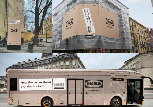
COPENHAGEN — IKEA has found a typically clever way to communicate something operationally significant but inherently unglamorous: large furniture items are now available in its city-centre store.
Rather than issuing a routine press release or relying on conventional outdoor placements, IKEA quite literally wrapped parts of Copenhagen in its iconic flat-pack aesthetic. Buildings, buses, and street installations were transformed into oversized cardboard boxes, complete with IKEA-style labels declaring:
“Now the larger items are also in stock.”
The message was impossible to ignore—and even harder to misinterpret.
A Simple Message, Executed at City Scale
For years, IKEA’s smaller urban formats focused primarily on:
- Inspiration and planning
- Kitchen and wardrobe consultations
- Smaller takeaway home accessories
Customers seeking bulky items like sofas, wardrobes, or beds were typically directed to suburban warehouse stores.
This campaign marks a structural shift in that retail model. The city-centre store is no longer just a showroom—it’s becoming a fully functional furniture destination.
Instead of explaining that shift through logistics-heavy messaging, IKEA visualised it.


By “boxing” parts of the city in its signature cardboard packaging look, the brand turned availability into spectacle. The flat-pack visual instantly signals storage, scale, and inventory—without requiring explanation.
It’s logistics, translated into brand language.
Why This Campaign Works (and Why Marketers Should Care)
This activation isn’t driven by wordplay or viral mechanics. It succeeds because it aligns tightly with brand DNA and operational truth.
The Idea Matches the Brand’s Visual Equity
Flat-pack packaging is one of IKEA’s most recognisable assets. The brown cardboard aesthetic, bold black typography, and schematic-style labelling are inseparable from the brand experience.
By using this as the campaign’s core creative, IKEA avoided the common trap of forcing novelty. The city simply became an extension of the warehouse.
That familiarity builds immediate recognition—and trust.
The Execution Reflects a Real Operational Change
Many campaigns dramatise incremental updates. This one communicates a tangible shift: customers can now purchase and collect larger items directly in the city.
There’s no exaggeration. No new positioning narrative. Just a clear operational update amplified through scale.
That honesty strengthens credibility.
Context Became the Medium
Rather than interrupting audiences with traditional billboards, IKEA embedded the message into everyday infrastructure:
- Public buses became moving flat-packs
- Building facades resembled giant cardboard cartons
- Street installations reinforced the packaging theme
Routine commutes became brand experiences.
The city itself functioned as media inventory.
A Broader Lesson in Modern Retail Communication
Retail transformation is often communicated through corporate language—“expansion of assortment,” “enhanced availability,” or “format evolution.”
IKEA translated supply-chain news into a cultural moment.
In doing so, it demonstrated three enduring principles:
- When the message is clear, simplicity scales
- When brand assets are strong, reuse beats reinvention
- When the change is real, creativity should clarify—not complicate
The campaign didn’t chase digital gimmicks or layered storytelling. No QR codes. No app prompts. No layered messaging ecosystem.
Just one announcement, expressed visually at urban scale.
Why This Matters in Today’s Retail Landscape
Urban retail is increasingly shifting toward:
- Convenience over destination travel
- Localised availability
- Hybrid showroom-warehouse formats
By signalling that larger items are now accessible centrally, IKEA addresses a long-standing friction point: the extra trip.
The campaign turns that operational improvement into brand equity.
Instead of quietly updating store capabilities, IKEA made the shift visible—literally.
Final Thought
IKEA didn’t just say, “We stock bigger items now.”
They transformed Copenhagen into something that looked like it came straight out of their warehouse.
That’s the power of aligning message, medium, and brand identity. Operational updates become memorable when expressed in a way only the brand can own.
And in a world where retail competition is intense and attention is fragmented, that kind of clarity is more valuable than spectacle.