


If your Google apps suddenly look slightly different today, you are not imagining it.
- What Changed In The New Google Workspace Icons?
- Google Drive Gets One Of The Biggest Changes
- Sheets and Slides Shift to Landscape Orientation
- Google Keep Loses Its Signature Shape
- Gmail Gets a Cleaner Refresh
- Why Google Keeps Redesigning Icons
- AI and Visual Ecosystems Are Becoming Connected
- Users Are Divided Over the Redesign
- Why This Matters Ahead of Google I/O
- Conclusion
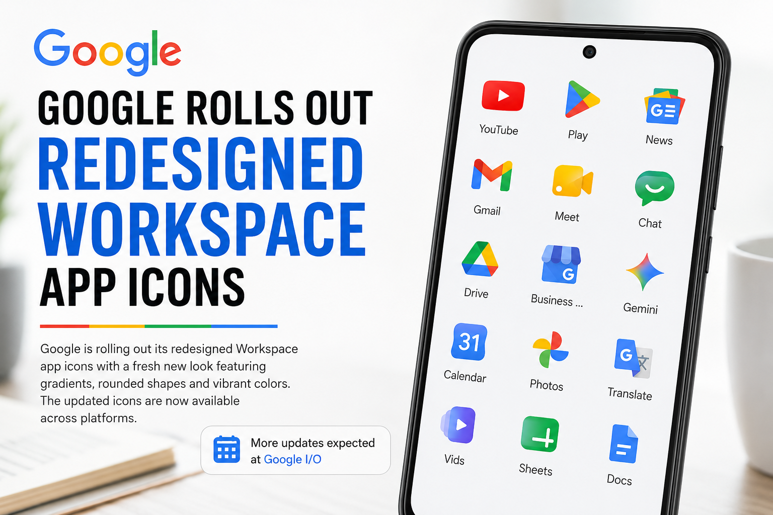
Google has officially begun rolling out redesigned icons across its Workspace ecosystem, introducing a more modern visual identity that leans heavily into gradients, softer transitions, cleaner shapes, and simplified branding.
The update follows earlier leaks that surfaced online last month, and users are now starting to notice the redesigned icons appearing across apps including:
- Gmail
- Google Drive
- Google Calendar
- Google Meet
- Google Chat
- Google Keep
- Google Docs
- Google Sheets
- Google Slides
The redesign arrives just ahead of Google I/O, where Google is widely expected to unveil broader updates across Android, Workspace, AI experiences, and visual design systems.
What Changed In The New Google Workspace Icons?
The most noticeable change is the introduction of gradient-based color transitions across many Workspace apps. Instead of flat, solid tones, the new icons now fade between lighter and darker shades, creating a softer and more dimensional appearance.
The redesign aligns closely with Google’s updated branding direction introduced through its refreshed Google logo last year.
Several apps also moved away from the earlier “rainbow-heavy” approach toward more simplified single-color dominance.
Examples include:


- Google Chat
- Google Meet
- Google Calendar
The goal appears to be improving visual distinction between apps while simultaneously creating a more unified ecosystem aesthetic.
Google Drive Gets One Of The Biggest Changes
Among all the redesigned icons, Google Drive arguably received the most dramatic visual overhaul.
The new version introduces:
- rounded corners
- softer gradients
- cleaner geometry
- removal of the small red accent previously visible in the bottom-right section
The icon now looks more aligned with Google’s newer Material You-inspired design language.
Sheets and Slides Shift to Landscape Orientation
One subtle but interesting update noted by users is that the icons for:
- Google Sheets
- Google Slides
have now switched into landscape orientation.
The change mirrors how most people actually use spreadsheets and presentation decks in real-world workflows, making the design feel slightly more intuitive and context-aware.
Meanwhile:
- Google Docs
- Sheets
- Slides
retain much of their familiar color structure, making their redesign less disruptive compared to other Workspace apps.
Google Keep Loses Its Signature Shape
Google Keep also received a noticeable redesign.
Previously, the icon showed a light bulb inside a yellow rectangular background. Now, the rectangle is gone entirely, leaving only a standalone yellow light bulb symbol.
While cleaner visually, the update significantly changes the icon’s silhouette, which may take time for long-time users to recognize instinctively.
The redesign reflects a broader minimalist direction Google appears to be embracing across its product ecosystem.
Gmail Gets a Cleaner Refresh
The Gmail icon has also been updated, though less dramatically than some other Workspace apps.
The redesign retains the familiar “M” envelope structure but introduces:
- smoother gradients
- cleaner edges
- softer transitions
The result feels more polished without radically changing one of Google’s most recognizable visual assets.
Why Google Keeps Redesigning Icons
App icon redesigns may appear minor, but for companies like Google, they are strategically important.
Visual consistency helps:
- strengthen ecosystem identity
- improve cross-platform recognition
- modernize user perception
- align products under a unified design system
As Google increasingly integrates AI across Workspace, Android, Search, and Gemini experiences, maintaining a cohesive visual identity becomes even more important.
The redesign also reflects the growing influence of:
- Material Design
- Material You
- adaptive UI systems
- AI-personalized interfaces
inside Google’s product strategy.
AI and Visual Ecosystems Are Becoming Connected
The rollout also arrives at a time when major technology platforms are heavily redesigning interfaces around AI integration.
Companies are increasingly focusing on:
- simplified UI systems
- adaptive layouts
- personalized experiences
- AI-native workflows
Google itself is aggressively embedding AI into Workspace products including:
- Docs
- Gmail
- Meet
- Drive
- Slides
through Gemini-powered productivity features.
- https://allmarketingupdates.com/best-ai-tools-for-social-media-marketing/
- https://allmarketingupdates.com/top-crm-with-marketing-automation-tools/
Users Are Divided Over the Redesign
As with most large-scale UI updates, reactions online have been mixed.
Some users appreciate:
- the cleaner aesthetic
- more modern gradients
- simplified visuals
Others argue the redesign may make certain apps harder to identify quickly because many icons now appear visually similar at first glance.
This tension between consistency and recognizability is common in large ecosystem redesigns.
Why This Matters Ahead of Google I/O
The timing of the rollout is unlikely to be accidental.
With Google I/O beginning soon, the icon redesign could signal a much broader visual refresh across Google’s ecosystem, potentially including:
- Android UI updates
- Gemini AI integrations
- Workspace redesigns
- Material You expansions
- productivity workflow improvements
Google often uses smaller visual rollouts ahead of larger ecosystem announcements to gradually acclimate users to upcoming design changes.
Conclusion
Google’s redesigned Workspace icons may seem like a small visual update, but they reflect much larger shifts happening across the company’s ecosystem.
The move toward gradients, simplified forms, and cleaner visual language aligns with Google’s broader push toward AI-native experiences, unified branding, and modernized interface systems.
Whether users love or dislike the redesign, one thing is clear:
Google is steadily reshaping not just how its products function, but how they visually communicate across billions of devices worldwide.